Tuesday, March 3, 2015

Project Seven - Alternative Processes through Digital Means

Cyanotypes

Before
After
Cyanotypes were mostly used with still-life subjects. For this photograph, I used a photo of tree bark that I had taken for a previous project. I used deep depth of field while shooting this image, as I felt that the texture of the bark would stand out more. I like how the movement of the bark shows through the blue hues of cyanotype image. 

Before
After

In all of my cyanotype pictures, I chose to use a darker blue. I wanted to give my own spin on the cyanotyope pictures. I also felt that the bright blue didn't work with my images as well. The bright blue is not as aesthetically pleasing to me as the navy blue is. This is a picture of Mt. Adams. In addition to darkening the foothills below it, I gave the image some grain to make it look older. I felt that the grain effect paired well with the cyanotype finish.

Before

After
Historically. cyanotypes were commonly used with still life subjects. As infant mortality rate was high, families would choose to immortalize the dead by photographing them. I wanted to emulate this practice. I used a picture of my sister that I flipped so that she would be lying down. I edited the image to make her eyes look darker and give the photo a more deathly appearance. Even though the subject is dark, I am happy with the final outcome of the photo.
_________________________________________________________________________________

Daguerreotype

Before
After
Daguerreotypes are typically portraits, so I used a picture that I had used for my emulation final. I applied a subtle texture while editing, along with a golden-brown tint. I also wanted to implement the gold framing technique which daguerreotypes were known for. I think the frame around the photo might not fit the mood, but I wanted to see what it would look like nonetheless.

Before
 After

For this second daguerreotype, I wanted to leave the frame off. I tried to give the edges a rougher look, but nothing looked right so I left it off. When editing, I wanted to give this image a more metal-like effect. I made the light part of the photo more apparent and gave it a more silvery color. I also painted over the texture I applied. The print gave the photo a distressed metal look. I came at this photo from a different angle than the first, but I think that I like my first edit more. 

_________________________________________________________________________________

Gum Bichromates

Before
After

The final alternative process that I chose to try is gum bichromate. Gum bichromate photography was developed in the 1800s and typically concerned images such as landscapes, but many different subjects can be found. There is no one person who is responsible for the development of the gum bichromate process. This type of photography involves layering different colors upon one another. This is a photograph of my sister, utilizing slow shutter speed. This was my first attempt at a gum bichromate. I love the texture in the photograph, but if I was to edit this photo again, I would soften the colors, particularly the blue. 

Before
After

I liked this gum bichromate edit better than the first one. This second image still has vibrant colors, but is a bit more subdued and more painterly. Gum bichromate photographs typically have watercolor-like effects. I am very happy with how this turned out. I layered bright yellow, indigo and magenta in this image. This is an image of Christmas tree lights that I blurred by used a slow shutter speed. 


Friday, February 27, 2015

Daguerreotype and Cyanotype Photography

Daguerreotype

Daguerreotype photography was invented by Louis Daguerre in 1839. In order to produce daguerreotype photographs, a photographer would polish a piece of silver-plated copper and make it look like a piece of mirror. A photographer would then treat it with a chemical to make it light sensitive and finally take a photograph, exposing the plate to the light as long as need be. Daguerreotype photographs characteristically have a metallic sheen to them are are black-and-white or in sepia tones. The photographs may also be framed by ornate gold borders.

Contemporary daguerreotype photographer: John Hurlock


Historical daguerreotype photographer: Robert Cornelius

Cyanotype

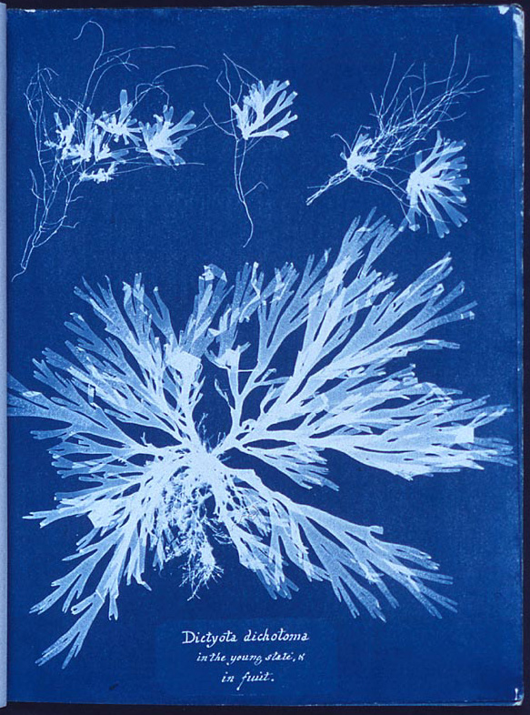
Sir John Herschel invented the cyanotype process in 1842, but it was Anna Atkins who applied the method to photography. Before, it had just been used as a means to copy notes and diagrams into blueprints.  The solution of a cyanotype photograph was painted onto specific paper and then exposed to the sun. Whatever elements may be lain atop of the paper, typically plants, will appear in an x-ray looking pattern. Cyanotypes are known for their dramatically blue hues.

Contemporary cyanotype photographer: Egill Ibsen


Historical cyanotype photographer: Anna Atkins

Tuesday, February 17, 2015

Project Six - Multiple Image Techniques

HDR Images

I find the HDR effect on this photograph very interesting. To me, it looks like something out of a sci-fi fairytale. The textures appear much harsher in the image, and you can't quite tell if it's real or not. Though very different than any edit I've ever given an image, I liked how this turned out.

This image was created using a different style of HDR. The first HDR photograph was given a harsh, unrealistic edit. This second image was created using different exposures of the moss. By putting them together, they created a photograph which reflected the accurate colors of the moss. I like the rich greens that the final photograph shows. 


Panorama

This panorama is of the track at Jackson Middle School. Though I captured the track completely, I had trouble while editing. I could not completely make the image flow together. There are some areas where the exposure of the grass changes and where the track doesn't line up. I attempted to fix some of these issues while editing, but I couldn't get it completely. 

Multiple Exposures

For this image, I took multiple images of a tree. I specifically wanted to take pictures of a tree because I wanted to see how the branches would look once layered upon one another. I chose to give this image an edit that I've never done before. I "inverted" the colors in Photoshop to give it this transparent effect. I like the chaos of the branches as well as the spooky mood the colors give off.

In order to create this photograph, I layered multiple images of hands. I had the hands create a shadow-puppet eagle shape because I thought that the wings (fingers) would appear as if they were moving. I had some trouble editing this at first, due to the dark background. However, I ended up only using four images which was better than the original idea I had, which helped with the editing issue. I am happy with the final edit and photographs that I chose to create this image. 

Tuesday, January 20, 2015

First Semester Emulation Final


The goal of this project was to emulate the work of a professional photographer. I chose to emulate a self portrait made by Beth Parnaby. In my emulation, I tried to use much of the same style and mood created in the photo while using a different edit. I feel very happy with the outcome of my final photograph.

Extra emulation - the first slide is my main emulation, but I loved this second emulation to show a different take on Parnaby's self-portrait. On this slide you will also find some extra information about the photographer.


Tuesday, December 2, 2014

Project Four - Balance and Contrast

PHOTOGRAPHS

Contrast in Scale
This photograph of my friend and I hiking has appeared once before on my blog. I wasn't satisfied with the way the original photo was edited, so I slightly changed it. I made the pinks of the jackets brighter and I dimmed the greens of the plants on the hillside. I felt that this picture exemplified the contrast-in-scale technique. The people on the hill are very small in comparison to the environment around them. 

Contrast in Value
This photograph of a sand-dollar represents contrast in value. As the eyes shift from left to right, the image gets progressively darker. This technique is known as chiaroscuro. I liked this edit because it makes the shell looks like a crescent moon. When editing, I intensified the blacks to make the lines of the shell stand out. This photo could also work for radial balance. The sand-dollar is not much bigger than the size of one's thumbnail. To make the tiny shell stand out while photographing it, I placed it on a black glove. 


Radial Balance
This is a flower in my mother's garden. It has been dried for the wintertime, so the shape and petals still remain. The flowers on the stalks radiate from the center of the plant, creating radial balance in the photograph. 

DIPTYCHS

I decided to compare the front of a sand-dollar to the back. I used the same edit on each. The edit causes the ridges and bumps on the shell stand out. Both the front and the back show radial symmetry and the size of the shells help to balance the overall image. 

In this diptych I compared two different views of a tree. The first image depicts the side of the tree. The moss and lichen has collected on the back in such a way as to give it a striped appearance. The second image the the stump of a tree. I like how the rings of the stump peek through the bright green moss.


TRIPTYCHS

Dog
These photographs are from the first project, the 30x2 assignment. They were three of my favorite images of my dog, Bailey. I gave them all a similar edit and ordered them from farthest view of the dog to the most up-close. 

Various Plants
For my final triptych, I decided to compare three types of vegetation. Each plant has different and distinctive leaves. I liked how each image varied in color and shape. I related the images to one another by darkening the overall photograph and making the blacks stand out to give them a more dramaitc look. 

KALEIDOSCOPES

Silhouette of a Camellia Bush
The original photograph was taken by standing underneath the bush and pointing the camera at the uppermost branches. I chose to give this kaleidoscope an oval edge rather than a circle edge because the circle edge cut out too much of the photograph. With the circle, the complex edges of the plant couldn't be seen. I gave this image a black and white edit to make it look much like a graphic design. 

 November Sunset
I gave this image a dark border because it fit with the darkness of the trees. I made the colors bolder and deeper so as to stand out against the black frame and the black trees. I liked the natural colors of the clouds that meld together in the image. 

Purple Winter Kale
When editing, I gave the kale such a boost in color that would never work if the image wasn't a kaleidoscope. I darkened the shadows and boosted the purple and pinks to full saturation. I boosted the aquas in the photo as well to draw attention to the center of the photo. I particularly enjoy the crinkled edges of the kale, which give the kaleidoscope a chaotic yet artful appearance.


EXTRA

Tree
More Winter Kale

Triptych