PHOTOGRAPHS
Contrast in Scale

This photograph of my friend and I hiking has appeared once before on my blog. I wasn't satisfied with the way the original photo was edited, so I slightly changed it. I made the pinks of the jackets brighter and I dimmed the greens of the plants on the hillside. I felt that this picture exemplified the contrast-in-scale technique. The people on the hill are very small in comparison to the environment around them.
Contrast in Value

This photograph of a sand-dollar represents contrast in value. As the eyes shift from left to right, the image gets progressively darker. This technique is known as chiaroscuro. I liked this edit because it makes the shell looks like a crescent moon. When editing, I intensified the blacks to make the lines of the shell stand out. This photo could also work for radial balance. The sand-dollar is not much bigger than the size of one's thumbnail. To make the tiny shell stand out while photographing it, I placed it on a black glove.
Radial Balance

This is a flower in my mother's garden. It has been dried for the wintertime, so the shape and petals still remain. The flowers on the stalks radiate from the center of the plant, creating radial balance in the photograph.
DIPTYCHS

I decided to compare the front of a sand-dollar to the back. I used the same edit on each. The edit causes the ridges and bumps on the shell stand out. Both the front and the back show radial symmetry and the size of the shells help to balance the overall image.

In this diptych I compared two different views of a tree. The first image depicts the side of the tree. The moss and lichen has collected on the back in such a way as to give it a striped appearance. The second image the the stump of a tree. I like how the rings of the stump peek through the bright green moss.
TRIPTYCHS
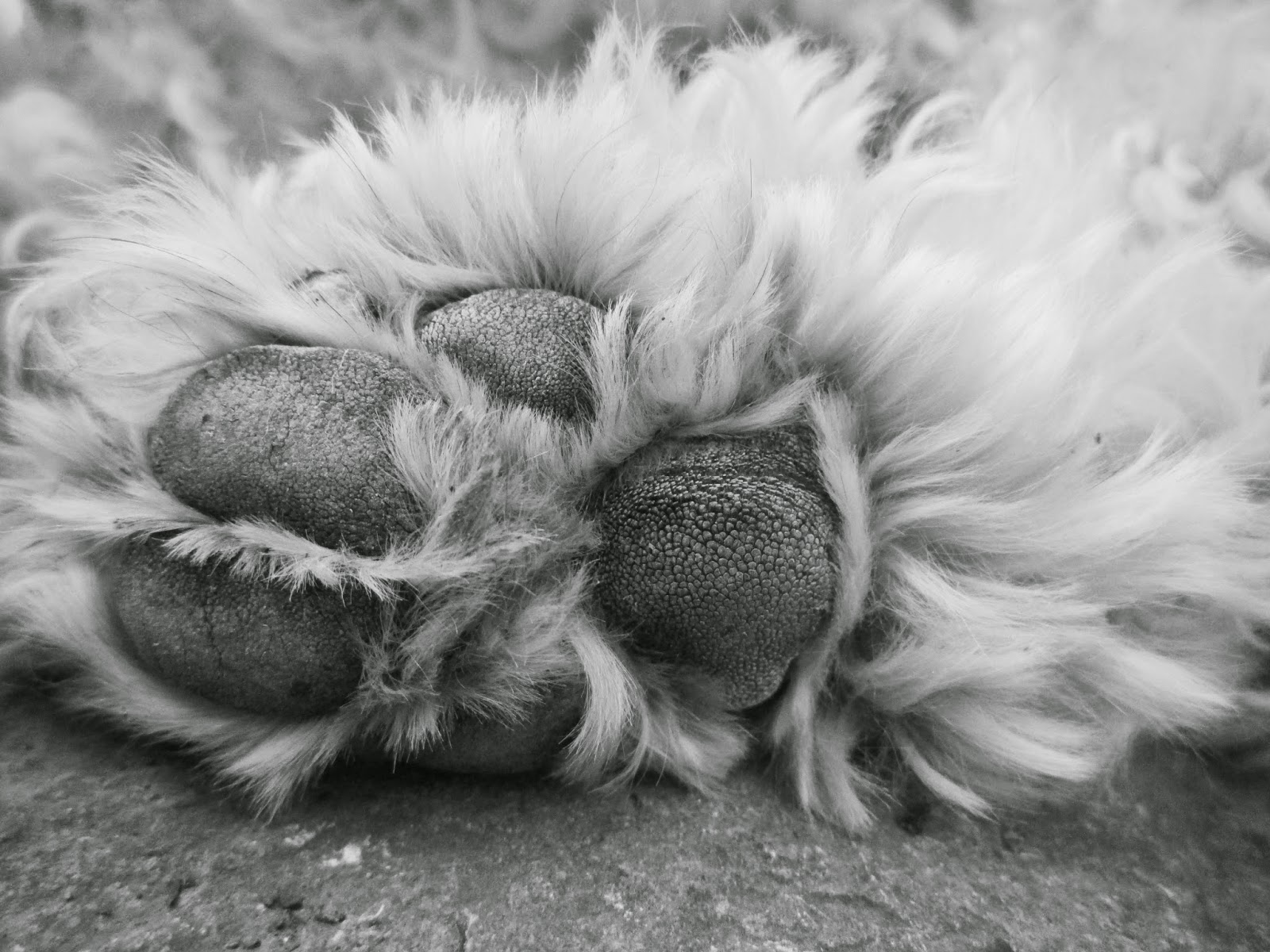
Dog

These photographs are from the first project, the 30x2 assignment. They were three of my favorite images of my dog, Bailey. I gave them all a similar edit and ordered them from farthest view of the dog to the most up-close.
Various Plants

For my final triptych, I decided to compare three types of vegetation. Each plant has different and distinctive leaves. I liked how each image varied in color and shape. I related the images to one another by darkening the overall photograph and making the blacks stand out to give them a more dramaitc look.
KALEIDOSCOPES
Silhouette of a Camellia Bush

The original photograph was taken by standing underneath the bush and pointing the camera at the uppermost branches. I chose to give this kaleidoscope an oval edge rather than a circle edge because the circle edge cut out too much of the photograph. With the circle, the complex edges of the plant couldn't be seen. I gave this image a black and white edit to make it look much like a graphic design.
November Sunset

I gave this image a dark border because it fit with the darkness of the trees. I made the colors bolder and deeper so as to stand out against the black frame and the black trees. I liked the natural colors of the clouds that meld together in the image.
Purple Winter Kale

When editing, I gave the kale such a boost in color that would never work if the image wasn't a kaleidoscope. I darkened the shadows and boosted the purple and pinks to full saturation. I boosted the aquas in the photo as well to draw attention to the center of the photo. I particularly enjoy the crinkled edges of the kale, which give the kaleidoscope a chaotic yet artful appearance.
EXTRA
Tree

More Winter Kale

Triptych